
Why Did So Many Countries Utterly Fai?
By Shlomo Maital
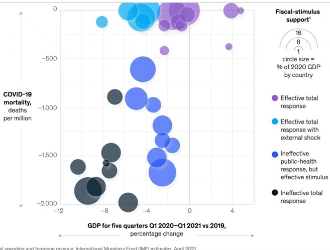
Source: McKinsey Global
McKinsey, global consulting company, provides a stsriking graph that summarizes global experience over the past five quarters, in combating COVID-19 and in resuscitating the economy. [1]
In the graph above, the y-axis represents COVID deaths per million, reverse axis (large to small), and the x-axis shows % change in GDP over five quarters. The size of the circles represents the relative magnitude of the fiscal stimulus (deficit), as % of GDP.
What does the graph say, anyway?
I believe – this: In July 1944, at Bretton Woods, the US Britain and other nations shaped a global economy that made many nations wealthy, including some previously-poor ones. Goods, services, money, knowledge flowed freely across borders.
But — policy wisdom? How to deal with crises?
Notice the enormous scatter. And notice how very few countries succeeded with public health measures (low mortality) while sustaining the economy (4% growth).
How did those three countries (upper right) do it? Were there special circumstances? What can we learn from those in the upper right?
And why did so many large countries (Brazil, India, South Africa, and yes, United States) utterly fail?
I plan to write about this. Meanwhile, I highly recommend reading McKinsey’s report. It is very optimistic. McKinsey predicts a global economic boom, if we play our cards right, and urges nations to use the resulting “growth dividend” to deal with pressing healthcare and public health problems.
I wish…. I wish countries would learn from one another – establish a G20 for national policy science, and do a thorough debrief on the pandemic, lessons learned, future policies, at the highest level.
A few academic scholars will do this but none of the political leaders will listen.
Biden? Worth a try?
[1] https://www.mckinsey.com/business-functions/strategy-and-corporate-finance/our-insights/looking-beyond-the-pandemic-could-the-world-economy-gain-more-than-it-lost-to-covid-19


1 comment
Comments feed for this article
June 24, 2021 at 9:54 am
rkenett
Clearly the financial stimulus, in absolute value, is not the story. What is missing from the graph (the analysis) is the dynamic. They use uibble charts “a la Rosling” but miss the point. https://www.ted.com/talks/hans_rosling_the_best_stats_you_ve_ever_seen